The Gift of Music

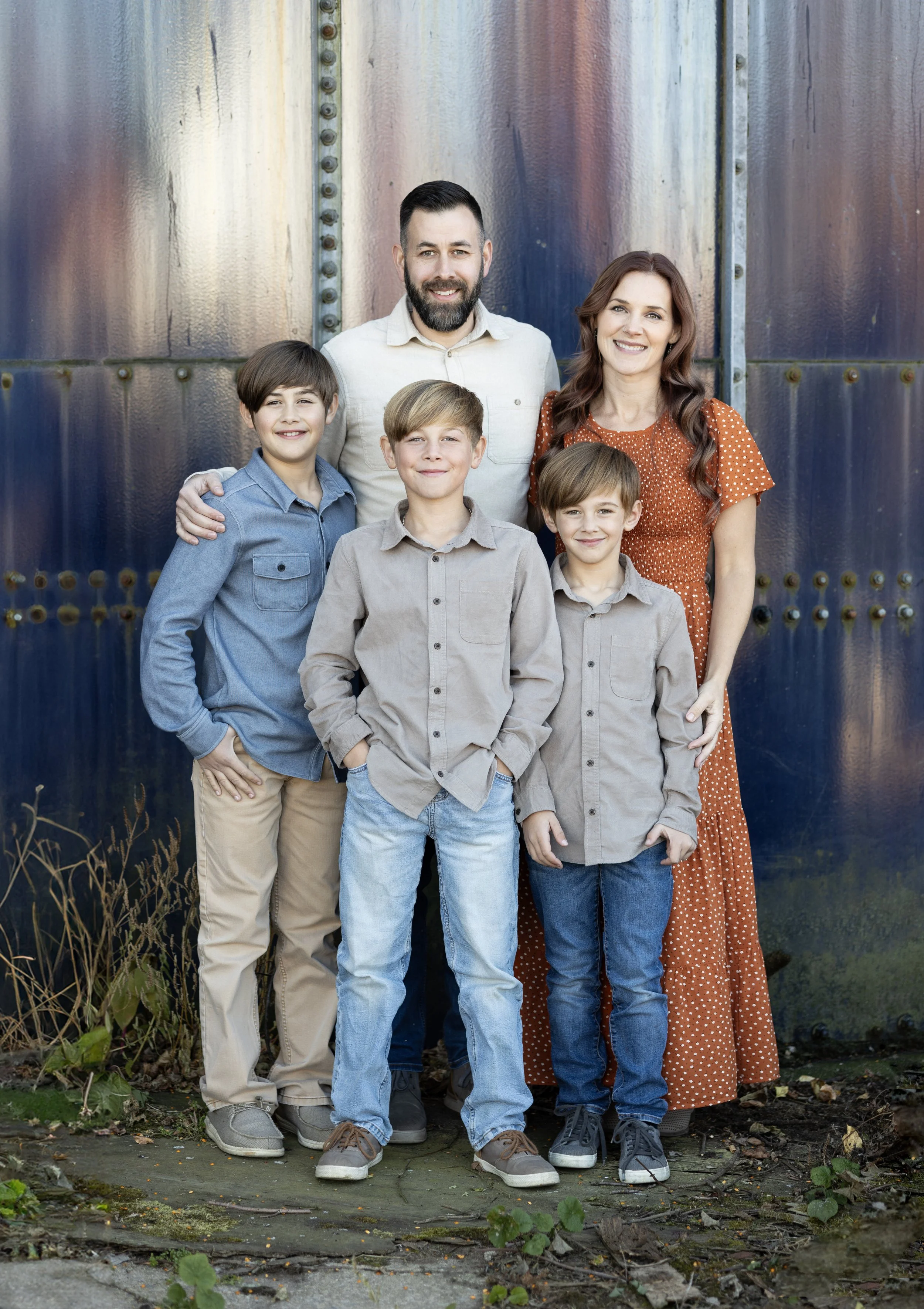
The day after I posted last on this blog, my life was shattered. My husband of 16 years, best friend, and father of my 3 boys, Casey Crafton, was on AA Flight 5342 when a Blackhawk helicopter crashed into the airplane over the Potomac River, killing all 67 people on board. Everything in my life changed in a moment and art and design took a back seat. I do find writing so healing, and I think I should utilize this blog more often, whether anyone reads it or not. My goal is to fill my life with positivity, so this I where I will begin on my website.

Music has been a lifeline for me this year. When I lost Casey, I felt like I was grasping at anything positive I could find that gave me the smallest amount of hope for my future, which looked quite bleak, and quite frankly, destroyed. I’ve always been an optimistic person by nature. Contentment came fairly easily, and I’d see the beauty in tough situations. I was even ok with bumps in the road, all the while assuming we were becoming stronger and more resilient and would be more thankful once we made it to the other side…

But this knocked me right off my feet. This felt impossible. I felt broken and struggled to find my positivity, wondering if it was gone forever, but God continually placed blessings before my eyes, one after another, reminding me I was not alone, He loved me and the boys and there was still beauty on this earth. I refused to accept this as the new me, or my new way of viewing the world around me. It felt horrible, like everything was gray and draped in sadness. I am a problem solver by nature, but there was no way to fix this or bring Casey back. That was the worst feeling of all. All my closest friends will remember me immediately talking about fighting to find joy again. I didn’t know how, but I was going to figure it out, because my boys had already lost their dad, and I wouldn’t allow them to experience a secondary loss of the mom they knew and loved.

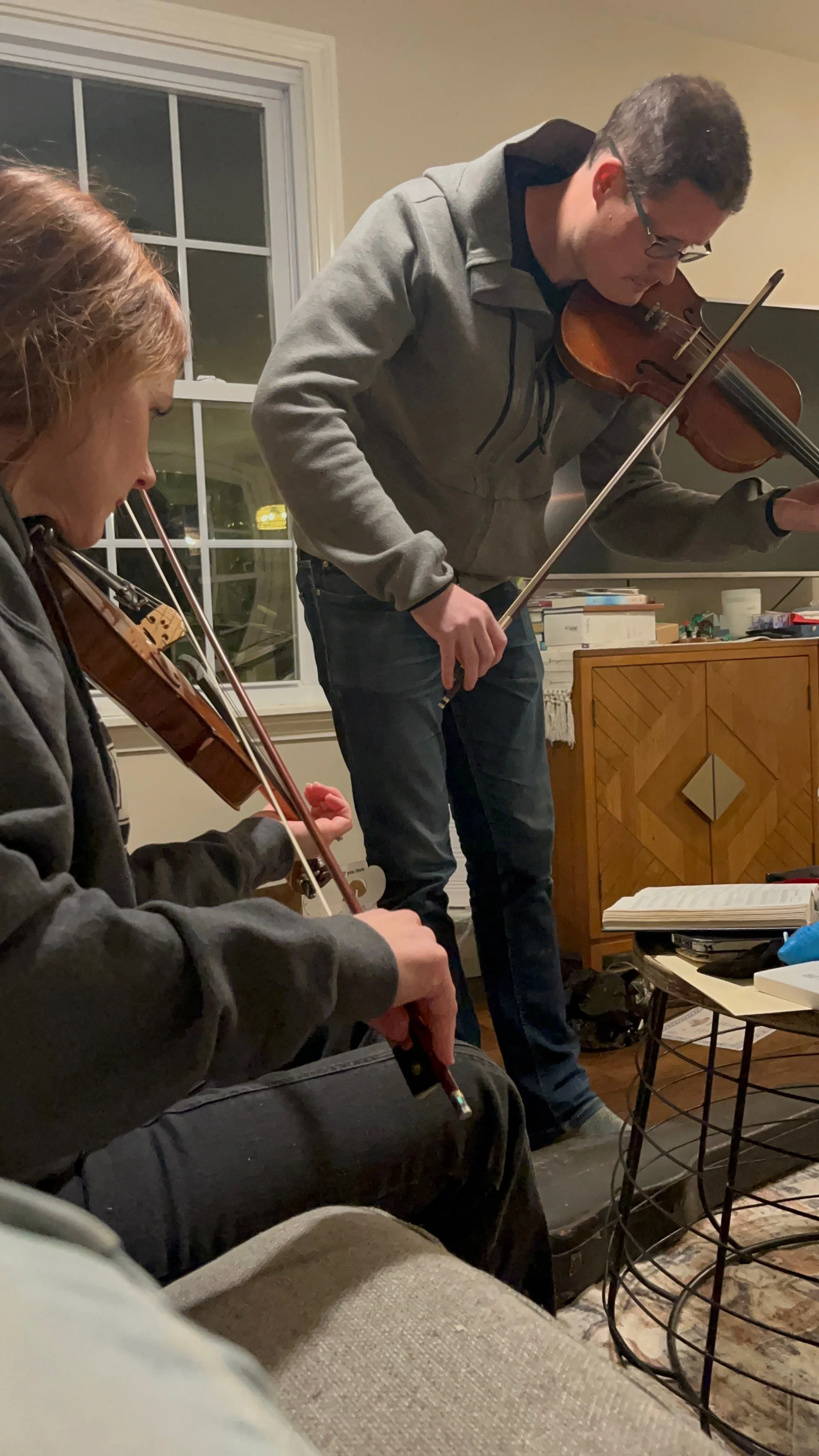
One of Casey’s best friends, Mark Koerbel, plays violin and was in town in the weeks after Casey’s death. I pulled out 2 violins for us to play (that alone is surprising, looking back), and while everything around me was sad and overwhelming, my emotions raw and my head spinning, I still felt love for music. How was that possible?? That gave me a small glimmer of hope that I held tightly to, and that I would revisit later on.

Casey was intertwined into everything in my life, and I felt loss at every turn. As the weeks and months marched on, I needed something to fill the quiet moments - something that felt positive, familiar and comforting with or without Casey. Since music has been something that has been a part of my life since I was a small child, I had hope that I could be fully immersed in music and not feel the loss, even for a moment. But also, it gave me a way to express my deepest loss in a beautiful way. Playing violin and singing helps me to feel connected to Casey, knowing I am doing one of the things he was most proud of.

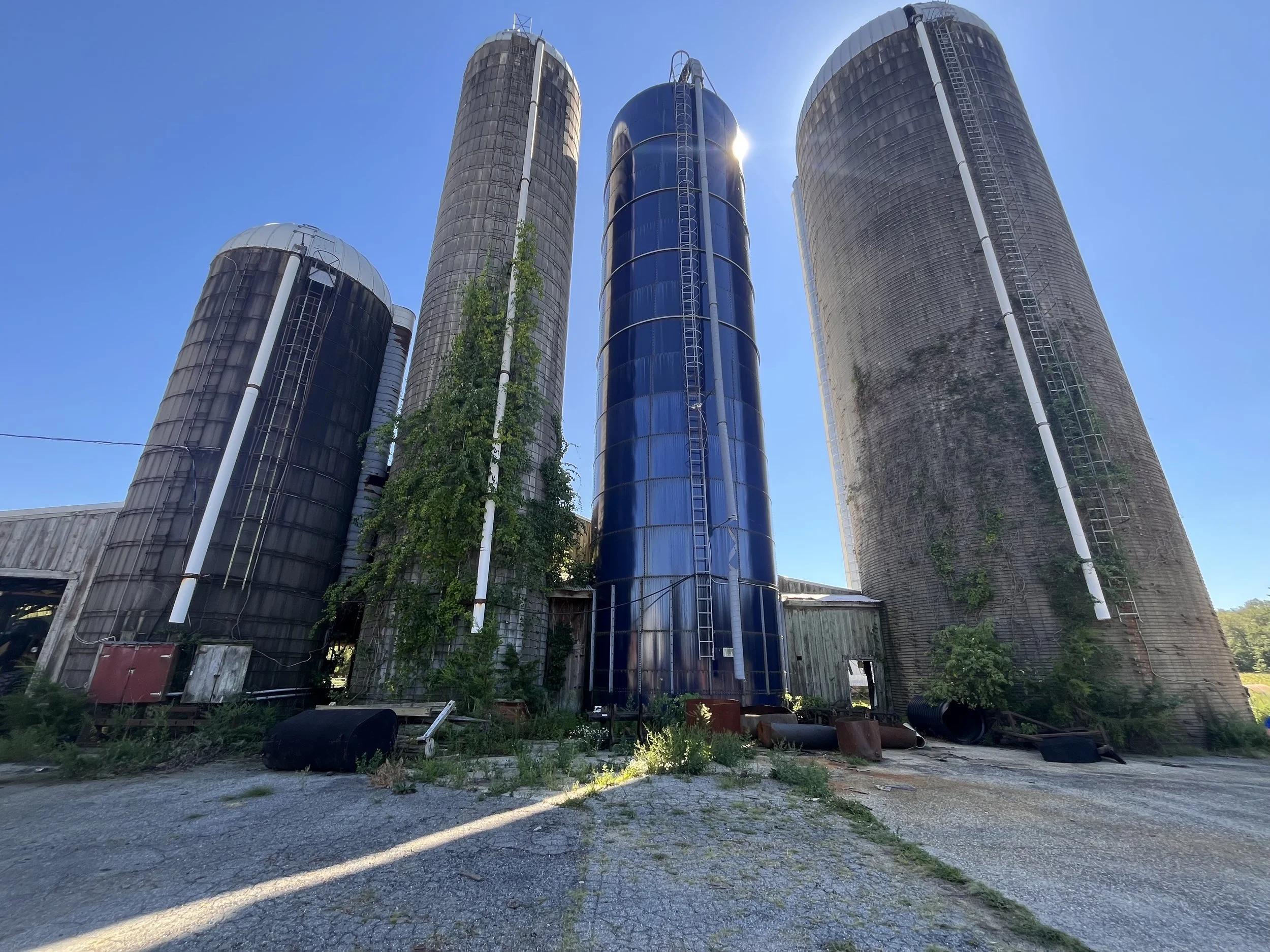
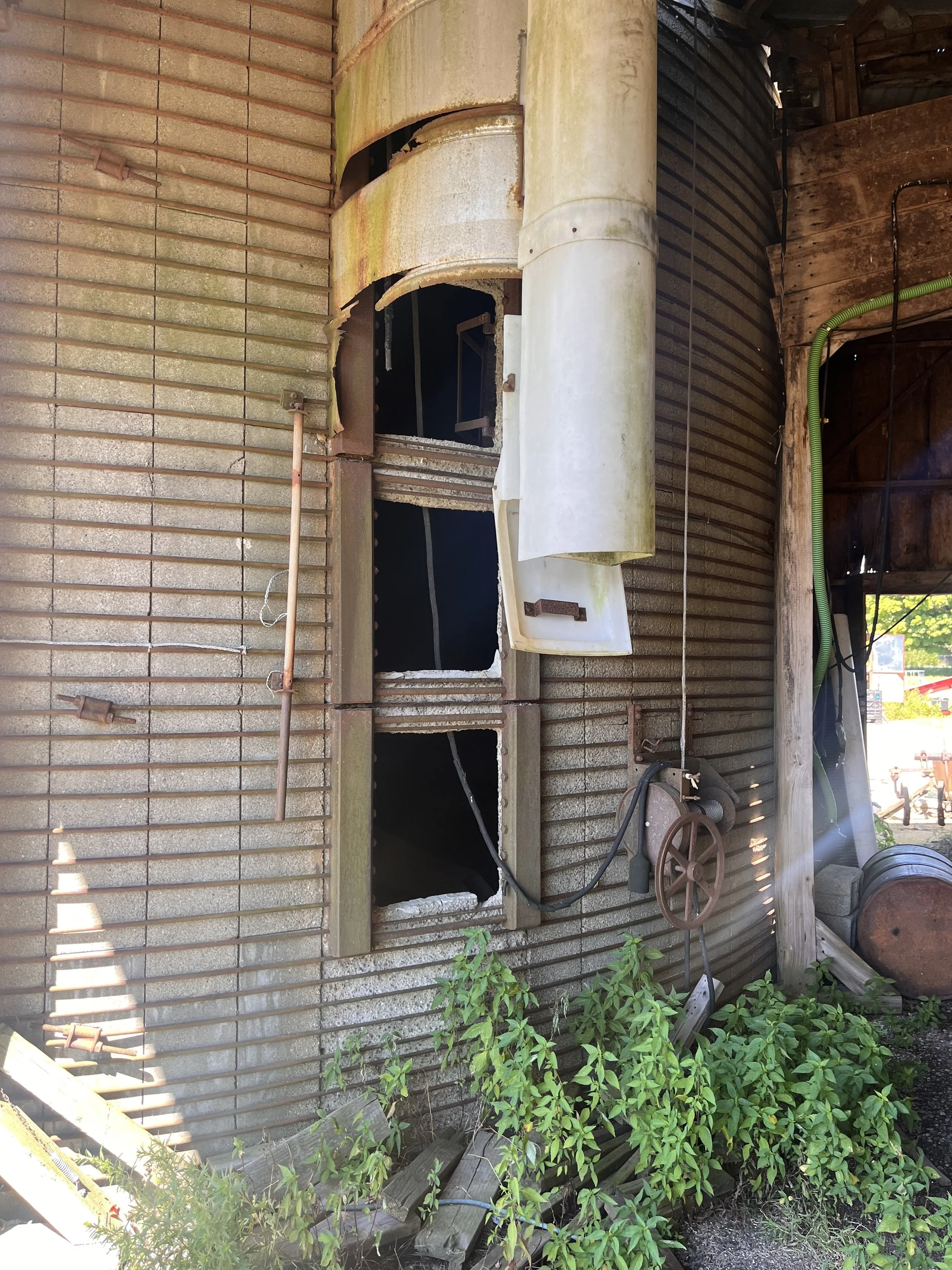
I had wondered for quite a while how music would sound in the empty silo on the farm I grew up on. When I finally got out there to try it out, it immediately became a special place of healing. In my tragedy, I felt I was shoved out in a spotlight in my most vulnerable state, for all the world to see, with no choice in the matter and nowhere to hide. The silo, located in a place full of happy childhood memories, was a place where I could be hidden away - it provided a place of solitude filled with music and that was what I really needed, more than I even knew. Now, when I find a little time here and there, I go out there to sing or play violin.

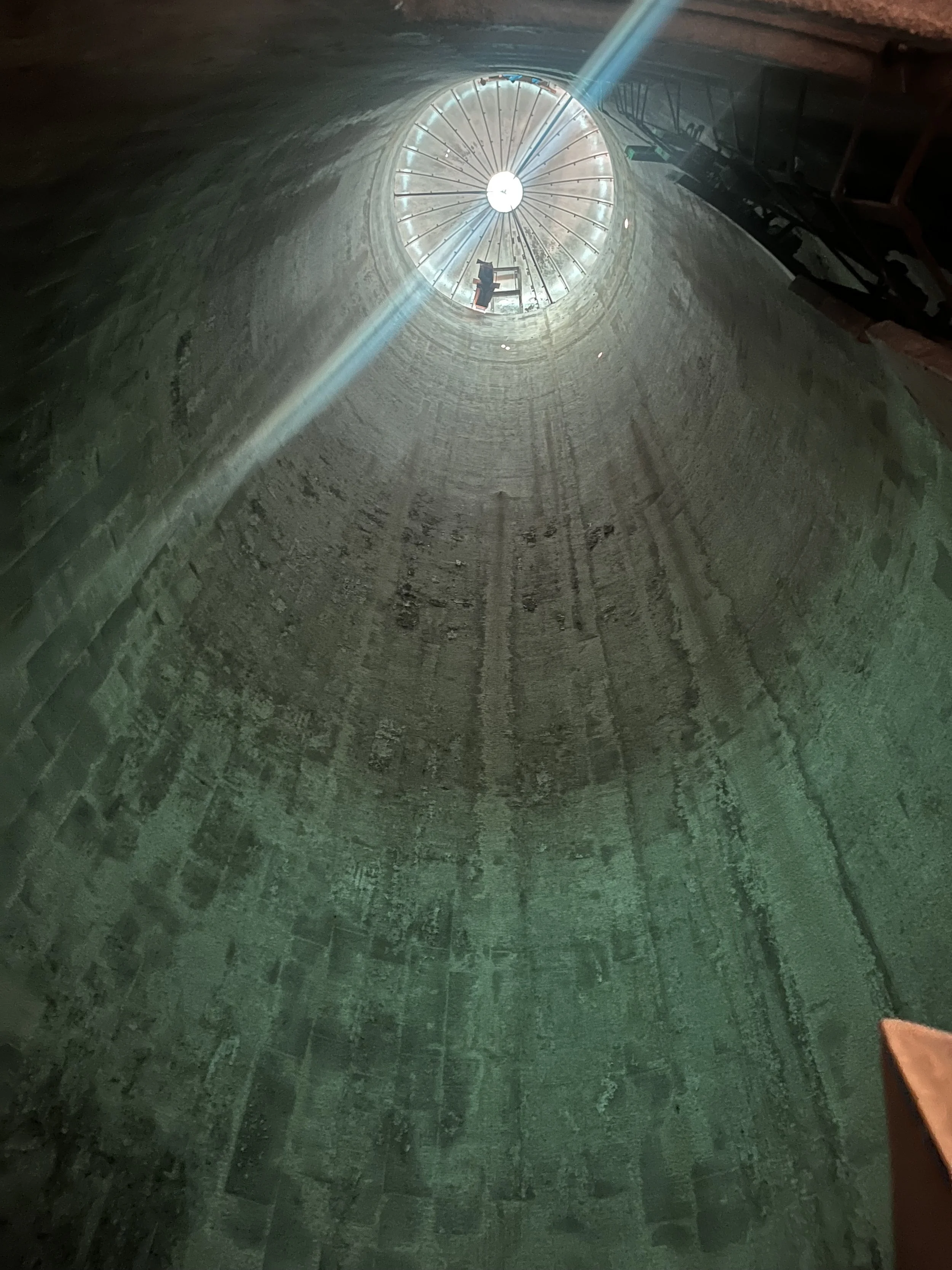
This past summer, one day after church, I recorded this song to see how my violin sounded with the acoustics of the silo. I had no intentions of sharing this publicly, but after nudges from multiple people (you know who you are), I realized while music can be so healing, it is also meant to be shared with others. I don’t have all the fancy equipment, and honestly don’t even know the best way to record music, but this will do for now.

Music has been a gift from God and I hope this is a blessing to you. ❤️

Cover of Shallow. Thank you Sing King for the backtrack.

Crescendo

This is another pattern from my Transposed Harmony collection, titled Crescendo. A crescendo in music is a gradual increase in the volume of a passage of music. The word comes from the Italian word crescere, which means "to grow".

Crescendo is available in my Spoonflower shop

The crescendo symbol is shaped like a less-than symbol and is shown below the musical staff.

The shape in the design resembles a crescendo (and decrescendo) symbol, and is actually based on a part inside a piano. Crescendo not only signifies a gradual increase in volume but also evokes a sense of organic growth, as the motifs on either end resemble flowers. The flowers were inspired by art I created from the piano parts. I love when a pattern design carries layers of meaning—something not as obvious but deeply personal to me, yet open to interpretation, allowing it to resonate with others in different ways.

You can find this pattern in my Spoonflower shop along with other colorways. It can be printed on fabric or many other household decor items or bedding. The photo below is a placemat set made from the pattern Crescendo, also available on Spoonflower.

Crescendo Placemat by Spoonflower

A second a third colorway below are other versions of this pattern, and I really love all 3 colors!

Crescendo in Mustard also available in my Spoonflower shop

Crescendo in white also available in my Spoonflower shop

Peachy Keen

I entered the current Spoonflower design challenge: Western Americana. The prompt was “to celebrate the rich heritage and rugged landscapes in this adventurous frontier to create a crowd-pleasing design that looks like it would belong on home decor and apparel use cases you’d see in a saloon, on a ranch or at a rodeo.”

I decided to submit a more feminine design. Maybe one you’d see in a girl’s bedroom or maybe on her horse blanket or a dress she may wear.

I added this pattern to my spoonflower shop and named it Peachy Keen, an old western phrase. I have other color variations I’m playing around with as well that I will add to my shop at some point, but this color scheme best fit the challenge.

Time Flies Birthday Invitation

This “Time Flies” invitation was a design idea I had because, at the time, my son at the time was obsessed with airplanes. We live near a model rc airplane field, and I would take him to watch the guys fly and their planes and he would yell, “Airpane!!!” and point at them. It was the perfect theme for his 2nd birthday party.

I always take photos of my boys for their birthday invitation before I design them, and let the photos inspire the design. Here are a few that I didn't use but that I think are pretty cute. He was in his own little world playing with his “airpanes”.

I also put this invitation in my etsy shop. You can find the listing here. Below is the an example of an invitation I designed on etsy for someone, based on the original design. I love that they used this design for someone who actually was a pilot!

Transposed Harmony Collection Logo

While still in the design process for my pattern collection, I named the collection Transposed Harmony and I designed a logo for it. A logo isn’t required for pattern design, but if I ever decide to license this collection, it’s good to have a logo to represent it. It could be used on websites and even printed on the selvage (the edge of the fabric where the pattern is not printed), if licensed for fabric.

Transposed is a musical term that means to write or play (music) in a different key or register from the original. A non-musical definition is to transfer to a different place or context. I had considered using the word Repurposed, but Transposed was the perfect replacement since it’s a musical term and gave the same idea I was trying to convey. The piano was repurposed from a working instrument to art and then from wall art to a pattern collection.

The definition of Harmony is the combination of simultaneously sounded musical notes to produce chords and chord progression having a pleasing effect. It also can mean a consistent, orderly, or pleasing arrangement of parts; congruity. Harmonious patterns is what I have worked hard at designing in this collection so they can be used in multiple combinations and for many different purposes.

Visually, the lines in the letters of the Transposed font reminds me of the lines on a musical staff and compliments the motif used as the O. Transposed looks more structured like music on a staff would be, while harmony is a more fluid script font to stand for the way that music sounds. Music can be very technical, but there is a fluidity to it where the musician has the liberty to add emotion and stretch the timing in a way that is unique to them and the way they feel the music. I think the structured font of Transposed and the fluid font of harmony really compliment each other nicely.

I also wrote a statement that I think fully encompasses the inspiration behind my collection as well the meaning I’m trying to convey.

This collection effortlessly blends the vintage allure of an old family piano with motifs inspired by its intricate inner mechanics and its musical past. While the piano is no longer creating music, its creative transformation inspired a collection that harmoniously weaved a tale of family, music and repurposed artistry.

Where the Wild Thing Are - Wild ONE Birthday Invitation

I wanted to share the first of many of my custom birthday invitations. It’s one of my favorite things to design! I started when my first son turned one (he’s 12 now and we are still going strong!) and I have designed something new and fun every year after that. It’s a great bonding time as we always talk about what they’re into that year, plan and execute a themed photoshoot with some rough ideas of what we might want, and then I let the photos inspire the design. It’s been so fun bringing their ideas to life and I love that I also can extend the ideas to other parents and kids by listing some of the designs in my Etsy shop.

front of the birthday invitation

This is an invitation I designed for my son’s Wild One birthday party. His middle name is Wilder, and while he isn’t as wild these days, he certainly was when he was one, as you can see in his photos! This theme is available in my Etsy shop. I offer various printable for a Where the Wild Things Are themed party, a birth announcement, t-shirt designs and more. Multiple items can be customized with your own photo as well. You can find the invitation here.

back of the birthday invitation. Like I said, he was wild!

I also designed several table signs to be used for a party. This one is available in my etsy shop here.

Scroll through some photos from the party to see some of the things available in my shop. Signs, food cards, party favor bag topper, and t-shirt designs!

In my Etsy shop, I have this printable file for the King of all the Wild Things shirt. Also available is this printable file for a Brother of the Wild Thing t-shirt. I printed on iron-on printer paper meant for dark tshirts and transferred it for his 2 brothers. I am always happy to customize t-shirt designs to say sister, dad, mom, Grandma or whoever else you need to make a birthday t-shirt for! This file can also be used for any other purpose you may have for the graphic.

brother of the wild thing

Printable file is available in my Etsy shop!

Below is a crown yourself sign for your party, also available in my Etsy shop. You can also buy crowns on Amazon for the party guests, and a special crown for the birthday boy or girl.

Another way to use this invitation is as a pregnancy announcement! I had this request through my etsy shop and I love it. So adorable!

This is another custom option to use on the backside of the invitation.

I hope someone is inspired by this blog post and lets the wild rumpus start! It’s a super fun theme - think bugles on all your fingers as claws like we all used to do as kids! Was it just me?

Feel free to reach out here on my website or through my etsy shop for any design request or new birthday theme ideas!

Forte

In music, forte is an Italian term that means loud or strong. It's a dynamic marking that instructs musicians to play a passage with a strong volume or intensity. Forte was the first pattern in the collection that I designed with a dark background, and I felt that it gave the pattern a boldness that the others didn’t have.

I also designed a second colorway of this pattern in a dark blue with teal accents. I love how it compliments the hero pattern in the second colorway. I think all 3 of these patterns work so nicely together!

Allegro

This is a fabric mockup of 2 color versions of my pattern design I named Allegro.

Allegro means “at a brisk tempo” in music, and this busier pattern has a brisk movement back and forth. All my patterns in this collection are named with a musical term. Since the musical staff is made up of lines, I want to have one “stripe” pattern that would mirror that, but since I’m not that fond of actual stripes typically, this is my version!

Musical staff

This pattern design was based on some of the pieces that are shown in this wall art below I made out of piano pieces.

I think this pattern would be cute on a baby onesie! If you sew and you decide to make anything with my pattern, I would love to see it! Please tag me on IG @rachelcraftonart

Newborn Delaney and Big Sister Elliot

Photography has always been a love of mine starting as a young teenager with a 35mm film camera my parents let me use.

While it’s not something I regularly do, or something I want to pursue full time, I occasionally will photograph newborns. When I had my first son, I realized how much I love newborn photography. As a more introverted-leaning person by nature, but also someone who is very comfortable with babies and children, I found that newborn and child photography was the perfect little niche for me! The babies didn’t need me to be a smooth conversationalist (good thing lol)! They just wanted a warm room, soothing music and some snuggles before being put in a cozy prop to sleep (I’m not going to lie, it’s not always that easy), and toddlers and small children were put at ease with just a little bit of silliness…and I always bring snacks! I love the planning - putting together colors and wraps and props - and then photographing those precious little faces!

These are some of the pictures from a photoshoot I did a couple of years ago. She was the sweetest baby!

Big sister Ellie was a cute as can be with those gorgeous blue eyes!

I almost always design a birth announcement after a newborn photoshoot, so the parents can print them as a card, or post the picture on social media or send it in an email or text to family and friends.

Family Cookbook and 90th Birthday Apron

About 10 years ago, the day before I went into labor with my second son, we got my Grandma’s “labor of love” sent off to the printer! She had compiled a family cookbook full of family recipes, history and photos. I was able to design the inside and outside covers and the divider pages for the cookbook.

The photos on the front and back cover are of my grandma when she was a little girl. She loves to cook and she loves to talk on the phone, so the photos were the perfect representation of her. The photo I scanned for the front cover had been hand-colorized many years ago, and I was able to scan the black and white photo on the back cover and colorize it to match.

A few years ago, I was able to take these photos of my Grandma with her cookbook. They are special photos I will cherish always.

This past June, we had a 90th birthday party for her and I was able to get some aprons made in her honor using the same artwork, but adding the words “90 Years of Love and Laughter.”